IELTS Academic Writing Task 1 Örnekleri
IELTS Academic Writing Task 1 sınavında çıkmış soruları ve cevaplarını bu bölümde bulabilirsiniz.
Aşağıdaki cevaplar, daha önceden sınava bizimle hazırlanan adayların cevaplarından derlenmiştir. Değerlendirmeler, IELTS uzmanı eğitmenler tarafından, writing değerlendirme kritelerine göre yapılmıştır.
Writing değerlendirme kriterleri hakkında daha detaylı bilgiye IELTS writing puanı nasıl hesaplanır linkinden ulaşabilirsiniz.
- Yardıma mı İhtiyacın Var?Hemen Bilgi Al!
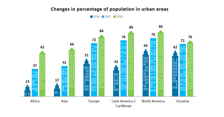
Soru: The bar chart below gives information about the percentage of the population living in urban areas in different parts of the world.

Summarise the information by selecting and reporting the main features, and make comparisons where relevant.
Cevap:
The bar chart shows the proportion of the population living in rural areas in six different continents (Africa, Asia, Europe, Latin America, Caribbean, North America, Oceania) in the years 1950, 2007 and the predictions for 2050.
Overall, changes in the percentage of the population in urban areas have an upward trend during the given period. It can be seen that the population in urban areas experienced an upward trend from 1950 to 2007, Africa’s ratios were the lowest, whereas the highest level of total population was seen in North America. Also, it is speculated that the same trend will be seen in 2050.
In 1950, the percentage of people who were living in Africa was only 15% which was the minimum ratio all over the World. The figure rose dramatically to 37% in 2007 and it is predicted that such steady increase will continue to rise up to 62%. However, in North America the percentage of people was approximately four times more than that of Africa (64%). It considerably went up by 15% and this trend will continue reaching the peak of 90% that will be the all time high all over the world.
Regarding other continents, it is clearly seen that Asia, Latin America/Caribbean and Europe experienced a dramatic rise of 24%, 24% and 21% respectively whilst Oceania’s total population percentage soared steadily by 9%, reaching the level of 71% from 1950 to 2007. Moreover, for all urban areas in different parts of the world will continue to increase for the predicted future in 2050.
Kelime Sayısı: 256
| Task Achievement | Coherence and Cohesion | Lexical Reource | Grammatical Range and Accuracy | Writing Band Score |
|---|---|---|---|---|
| 8 | 6 | 6 | 7 | 7.0 |
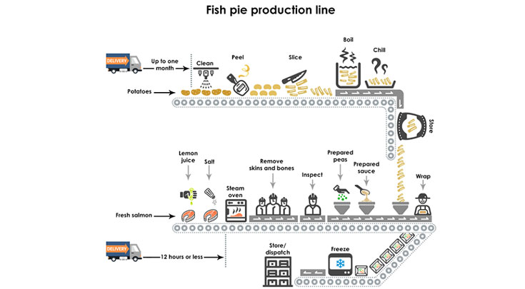
Soru: The diagrams below give information about the manufacture of frozen fish pies.

Summarise the information by selecting and reporting the main features, and make comparisons where relevant.
Cevap:
The given picture illustrates the various steps involved in the commercial production of frozen fish pies. Overall, it is apparent that four ingredients are used such as fresh salmon(a large edible fish), peas, Sauce and potatoes. The preparation process is separate for each ingredient.
To begin with potatoes, The potatoes are delivered to the factory up to a month in advance. Potatoes are cleaned, peeled and sliced respectively. These slices go through boiling and chilling stage before storing for the pie preparation. Turning to the fish preparation, it takes more time than the preparation of potatoes. Fish delivered to the factory within 12 hours. Lemon juice and salt are added to these slices before they are steamed in the oven. In the next step, skin and bones removed by hands. All the material go through the visual inspection step.
Peas and Sauce are needed for the pie preparation. Pies are collected in microwaveable containers. Peas and Sauce that are prepared added to the fish, and then the pie is covered with cooked potato slices. The pies are wrapped manually and are frozen before they are either stored or dispatched.
Kelime Sayısı: 189
| Task Achievement | Coherence and Cohesion | Lexical Reource | Grammatical Range and Accuracy | Writing Band Score |
|---|---|---|---|---|
| 8.5 | 6.5 | 6.0 | 7.0 | 7.0 |
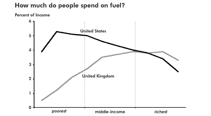
Soru: The graph below gives information about how much people in the United States and the United Kingdom spend on fuel.

Summarise the information by selecting and reporting the main features, and make comparisons where relevant.
Cevap:
The provided line graph illustrates detailed information about the proportion of expenditure on the petrol of people from the UK and the USA among the three classes.
At first glance, the United States of America is inversely proportioned in comparison with the United Kingdom in the figure for income spending on petrol. To be more precise, the higher percentages of money in the US, which are paid for gas, the lower rate of this in the UK.
On average, it is noticeable that the figure for the expenditure of the poorest American was approximately 5-fold higher than this in the UK. Nevertheless, there were equal figures in the payment of the richest inhabitants in both countries, which accounts for just under 4% of ones’ wages. Besides, the majority of expenses go to the poorest kind of people paying money for petrol live in the United States, while the amount of currency spending for gasoline of the poorest American contributes to roughly 0.5%.
It is noticeable that in terms of Americans, the poorest ones can be the highest consumers of petrol, at over 5% of their income. The middle-income and the richest only spend nearly 5% and 4% of their earning respectively. The most affluent group of people can use about 4% of their salary for petrol in the UK.
Kelime Sayısı: 219
| Task Achievement | Coherence and Cohesion | Lexical Reource | Grammatical Range and Accuracy | Writing Band Score |
|---|---|---|---|---|
| 8.0 | 6.5 | 6.0 | 6.0 | 6.5 |
Soru: The table below shows the results of surveys in 2005, 2010 and 2015 about McGill University.
| 2005 | 2010 | 2015 | |
|---|---|---|---|
| Teaching quality | 74 | 72 | 78 |
| Library resources | 86 | 88 | 87 |
| Students Services | 54 | 81 | 95 |
| Range of modules offered | 39 | 31 | 25 |
| Sports and social facilites | 65 | 65 | 65 |
Summarise the information by selecting and reporting the main features, and make comparisons where relevant.
Cevap:
A comparison of the proportion of students who rated McGill University good for five different aspects in 2005, 2010 and 2015 is charted in the given table.Overall the students’ rating was mostly positive in all the three years, except in case of the range of modules offered.
As per the chart, most students were very satisfied with the library resources all through the period, and the rate was between 86 and 88. A considerable proportion of students rated the quality of teaching good (between 74 and 78) despite a mere dissatisfaction in 2010 (72).
Another area where the students found themselves comfortable with was the sports and social facilities, and the satisfaction rate for this stood constant, when exactly 65% responded positively to it.
It is interesting to note that there was a considerable growth in the proportion of students who marked student’s services as good which made it the most positive aspect of the University by 2015. (The growth percentage ranged between 54 and 95).
The only exception was in the case of range of modules offered. Here, a decline is seen in the rate of students who marked it as satisfactory (from 39 to 25 between 2005 and 2015).
Kelime Sayısı: 201
| Task Achievement | Coherence and Cohesion | Lexical Reource | Grammatical Range and Accuracy | Writing Band Score |
|---|---|---|---|---|
| 7.0 | 6.5 | 6.0 | 6.5 | 6.5 |
Soru: The graph shows the impact of vaccinations on the incidence of whooping cough, a childhood illness, between 1940 and 1990 in Britain.

Summarise the information by selecting and reporting the main features, and make comparisons where relevant.
Cevap:
The graph shows the changing number of cases of whooping cough in Britain from 1940 to 1990, and how the introduction and use of a vaccine for the disease affected the pattern. Apparently, there was a direct link between the administration of the vaccine and the number of cases of whooping cough among children during this period in history.
Overall, the number of cases fell from a high of 170,000 to almost zero. However, there were significant fluctuations in the trend. For example, just after 1940, there was a surge in the number of cases from 50,000 to approximately 170,000. Although the figure fell back in the next few years, it peaked again in the early 1950s and fluctuated considerably until the introduction of a vaccination in the late 1950s.
Following this, the number of cases dropped sharply to well below 20,000 in the mid-1970s, until a sudden fall in vaccinations, from 81 percent to 30 percent, resulted in a parallel rise in the incidence of the illness. Figures then went up again to 60,000 around 1980, but gradually fell back to their earlier level as vaccinations were resumed. By 1990, 94 percent of children were being vaccinated against whooping cough, and there were few, if any, cases.
Kelime Sayısı: 208
| Task Achievement | Coherence and Cohesion | Lexical Reource | Grammatical Range and Accuracy | Writing Band Score |
|---|---|---|---|---|
| 7.0 | 6.0 | 6.5 | 7.0 | 6.5 |
IELTS Writing Puanı Nasıl Yükseltilir?
IELTS Writing puanını yükseltmek için IELTS Writing Assessment hizmetini inceleyebilirsiniz.
- Yardıma mı İhtiyacın Var?Hemen Bilgi Al!
Etiketler
ielts writing samples | ielts writing örnekleri | ielts writing task 1 örnekleri | ielts writing task 1 samples

